Most websites that disappoint their owners do so for the same reason: they were decorated before they were planned. Someone picked a template, fell for a color scheme, and only later asked what the site was supposed to do. Good web design runs the other way. You decide what the site must achieve, who it's for, and how someone moves through it — and only then do layout, type, and color come in to serve those decisions.
The short version: design is problem-solving, not decoration. Get the goals, structure, and content right, and a clean visual layer will do its job. Skip that work, and no amount of polish will save the site.
Why web design is a business decision, not a taste decision
It's tempting to judge a website by whether you like how it looks. But the people who visit your site aren't grading your taste — they're trying to do something: learn what you offer, decide if they trust you, and take a next step. A site "works" when it makes that easy.
That reframing changes everything. Instead of asking "is this pretty?" you ask "does this help the visitor get what they came for, and help my business get what it needs?" Those two answers, aligned, are what good design delivers.
Step 1: Define the one job your site must do
Every effective site has a primary job. A local services business needs the phone to ring. An online store needs the checkout completed. A B2B site needs a demo request or a qualified lead. Pick the single most important outcome and name it out loud.
Then list the secondary actions — newsletter signup, portfolio view, a download — in priority order. This hierarchy is the backbone of every later decision. When you're unsure whether an element belongs on the homepage, you ask whether it serves the primary job. If it doesn't, it competes with it.
A site that tries to do everything equally well usually does nothing clearly.
Step 2: Know who it's for
Design for a specific person, not "everyone." A first-time buyer who doesn't know your category needs reassurance, plain language, and proof. A returning expert wants speed and detail. You can't speak to both with the same emphasis, so decide who comes first.
Write down what that primary visitor already knows, what they're worried about, and what would make them act. Those notes become your content brief and your tone. The clearer the audience, the easier every design choice becomes — because you have someone real to design for.
Step 3: Map the structure before the visuals
Structure is how content is organized and how people move between pages. Get this right and the site feels obvious to use; get it wrong and no visual polish will rescue it.
- List your pages and group them the way a visitor thinks, not the way your org chart works.
- Sketch the navigation — top-level items should match what people actually look for.
- Plan the key journeys — trace the click path from landing to the primary action and remove every unnecessary step.
A simple wireframe, even on paper, is worth more here than a finished mockup. It forces you to decide what goes where and in what order, while changes are still cheap.
Step 4: Plan content before layout
Layout exists to present content, so the content should come first. Designing around "lorem ipsum" almost always produces a layout that breaks the moment real words, of real length, arrive.
For each key page, draft the actual message: the headline that states the value, the proof that backs it, and the call to action. Short, specific copy beats clever copy. If you can't say what a section is for in one sentence, the section probably shouldn't exist.
This is also where you decide what visuals you genuinely need — real product shots, team photos, diagrams — versus generic stock that adds weight without meaning.
Step 5: Make the visual layer serve the message
Now the parts people usually call "design" come in, and they have a job: make the right things easy to see and the priority action obvious.
- Layout and whitespace guide the eye; the most important element on a page should be the most visually prominent.
- Type carries most of the experience — readable sizes, clear hierarchy, and restraint beat decorative fonts.
- Color sets tone and, used sparingly, points at what to click. An accent color works because it's rare; spread it everywhere and it stops directing attention.
- Consistency — repeating patterns for buttons, headings, and spacing — makes a site feel trustworthy and easy to learn.
The goal isn't to be noticed. It's to be effortless.
Step 6: Design for mobile and speed from the start
Most visitors arrive on a phone, so a design that only works on a wide desktop screen is already failing the majority. Plan the mobile view as a first-class layout, not an afterthought, and make sure tap targets, text size, and the primary action all hold up on a small screen.
Speed is part of design, too. Heavy images, too many fonts, and bloated effects make a site slow, and a slow site loses people before they see any of your careful work. Favor lighter assets and fewer moving parts; the fastest design choice is usually also the cleanest one.
Step 7: Plan to measure and improve
A launched site is a starting point, not a finish line. Decide upfront how you'll know if it's working: are people reaching the primary action, where do they drop off, what do they ignore?
Set up basic analytics, watch real behavior, and change one thing at a time so you can tell what helped. The best sites aren't designed perfectly once — they're improved steadily based on what real visitors do.
Frequently asked questions
How long should designing a website take? It depends on scope, but the planning — goals, structure, content — is where the time pays off. A small business site might take a few weeks; rushing the planning to save days usually costs more in rework later.
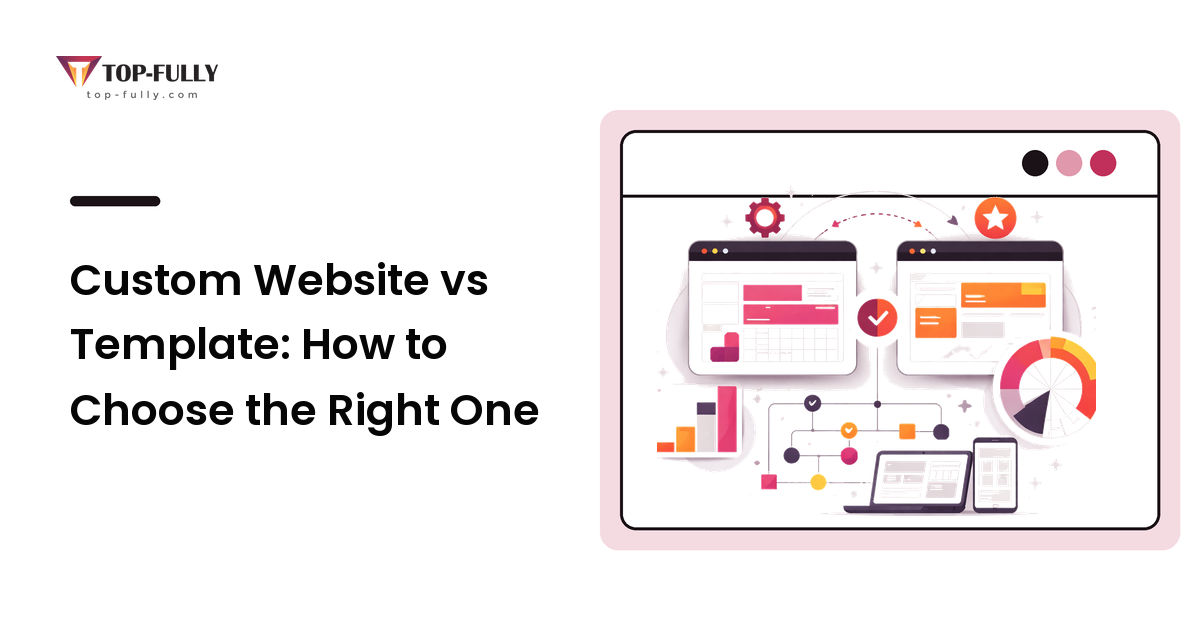
Should I use a template or a custom design? A good template is a sensible, lower-cost choice when your needs are common and you value speed. Custom design earns its cost when your site has unusual requirements, a strong brand to express, or journeys a template can't support cleanly. Decide based on need, not prestige.
How many pages does my site need? As few as it takes to do the job well. Start from the actions you want visitors to take and add only the pages that support them. Extra pages dilute focus and add maintenance.
Who decides if the design is "good"? Your visitors, through their behavior. Opinions about looks are useful early, but the real test is whether people can find what they need and complete the primary action. Measure that.
Do I need to plan content before I have a design? Yes. Layout is built to present content, so drafting real messaging first leads to a design that fits your actual words instead of breaking when they arrive.
Bringing it together
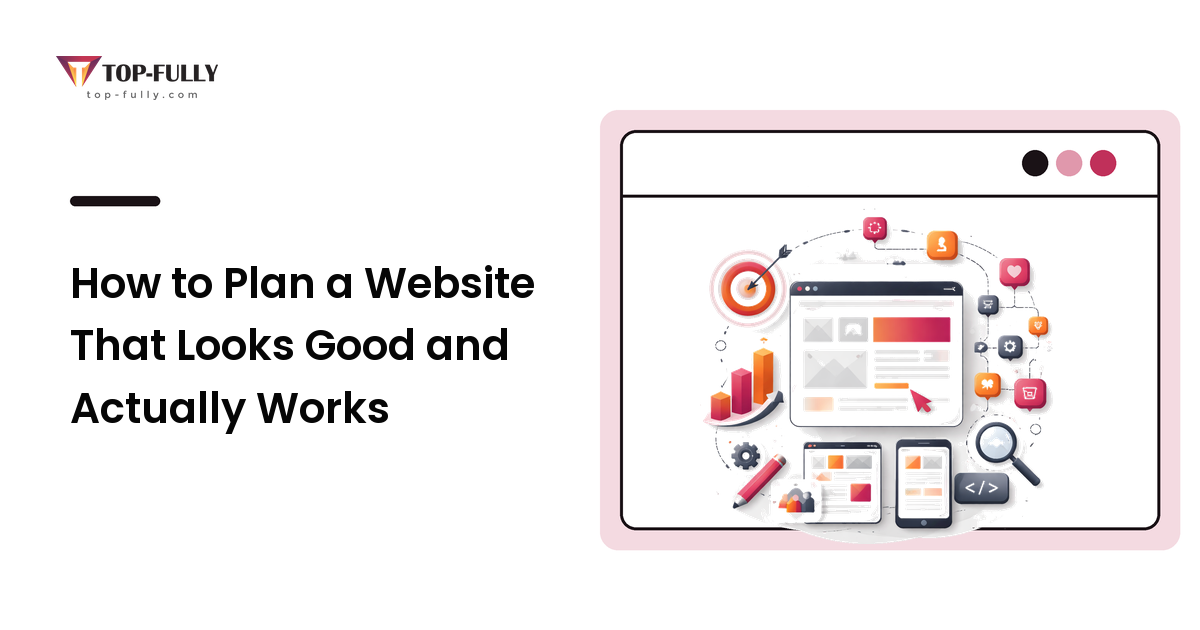
A website that looks good and works is the result of decisions made in order: define the job, know the audience, map the structure, plan the content, then design to serve all of it — fast, mobile-first, and measurable. Decoration is the last and smallest part of the work, not the first.
Write down your site's one job and the three actions you want visitors to take before you ever look at a design. That single page of clarity will shape a better site than any template gallery ever could. When you're ready to turn that plan into a finished, built website, Top Fully does this work end to end.